

Designing a Scalable Live Q&A Experience
From research to first launch milestone—building a tool that empowers real-time audience participation.
The Team
1 PM
3 Designers
4 Developers
My Role
Researcher
Designer
Platform
Desktop
Timeline
4 months

Summary & Impact
I led the end-to-end design of the Live Q&A experience, focusing on improving usability and driving community engagement. Leveraging tools like Figma for responsive UI design, FigJam for journey mapping and stakeholder workshops, and Google Surveys for unmoderated usability testing, I uncovered key friction points and rapidly iterated based on user insights. I partnered closely with PMs and engineers to build scalable design systems and delivered high-fidelity prototypes, annotated specs, and developer-ready assets to support a seamless handoff. This project showcases my ability to lead with research, modernize legacy workflows, and ship polished, user-centered solutions in fast-paced, cross-functional teams.
Project Overview
Turning Workarounds into Opportunity
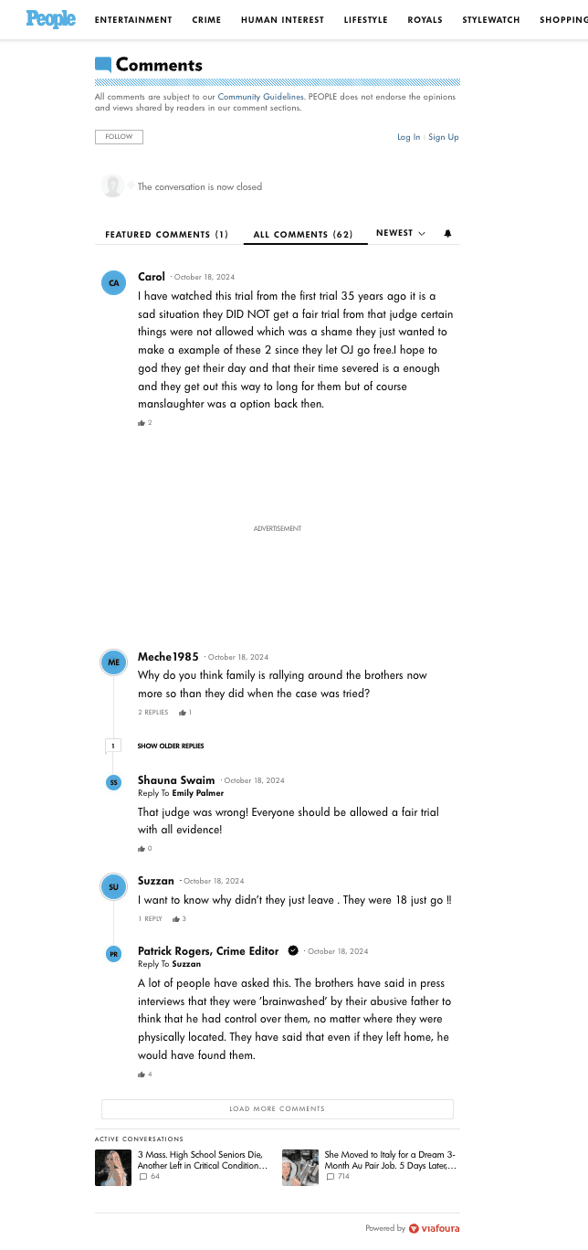
When several customers started repurposing our commenting tool for live Q&A sessions, we saw an opportunity to meet an emerging need. Although our tool wasn’t built for real-time engagement, clients were adapting it to host interactive events.
“More than five of our customers are repurposing our commenting tool as a live Q&A feature.”
— Customer Success Lead
I joined discovery calls to learn how teams were making it work — and where it was falling short.
Key Insights
From those conversations, three key issues came up repeatedly:
“We can still use comments for live Q&A, but it doesn’t highlight the answer.”
“Threading is hard to navigate — it’s difficult to find the right response.”
“We want to spotlight our experts, but the current system doesn’t support that."
These pain points showed us that a dedicated solution was needed — not a workaround.

The Decision
We decided to build a Live Q&A tool to support real-time engagement and host AMA-style sessions directly on publisher sites. The product would:
Improve live experiences for current customers
Attract prospects looking for interactive tools
Lay the foundation for a new design system and component library
Challenges
While there was strong alignment on the idea, internal expectations created pressure:
“I want us to ship this product in June.”
— VP of Product
“We need to define the scope before we commit.”
— Engineering Team
We responded by defining an MVP focused on key user needs, and committed to building a new front-end codebase to support scalability.
Research to MVP
From discovery interviews to prioritized feature set
Research Methodology
To move fast without losing depth, I conducted semi-structured interviews with 5 external stakeholders in two weeks, combining early prototype feedback with open-ended exploration.
To speed up synthesis, I used AI tools to summarize interview notes, which saved hours of manual work and revealed clear patterns early on. This allowed us to make quick, informed decisions and align the team around user needs.
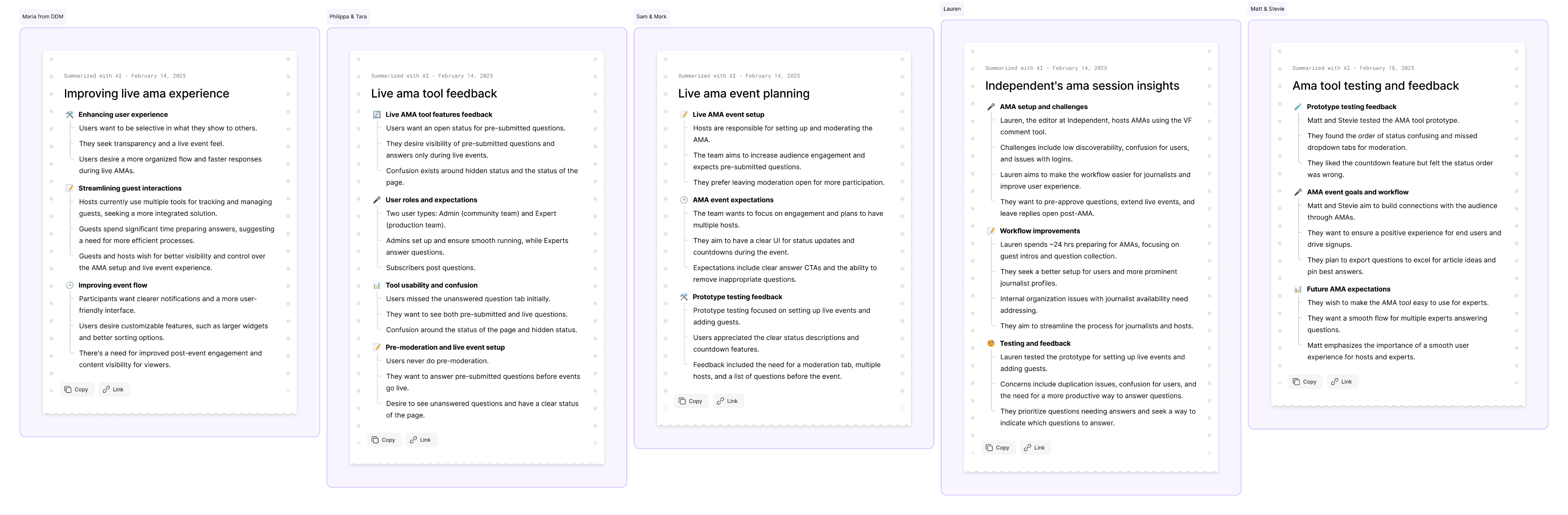
Key Insights & Strategic Direction
The AI summaries revealed three major themes across interviews:
Answers were hard to find. Users struggled to locate expert responses due to confusing threading.
Expert visibility was lacking. Publishers wanted their guest speakers or hosts to stand out more clearly.
Moderation was time-consuming. Managing live threads was harder than expected without real-time tools.
These insights gave us a strong foundation to define core MVP goals:
Improve findability
Highlight expertise
Streamline live moderation
Personas & Their Impact
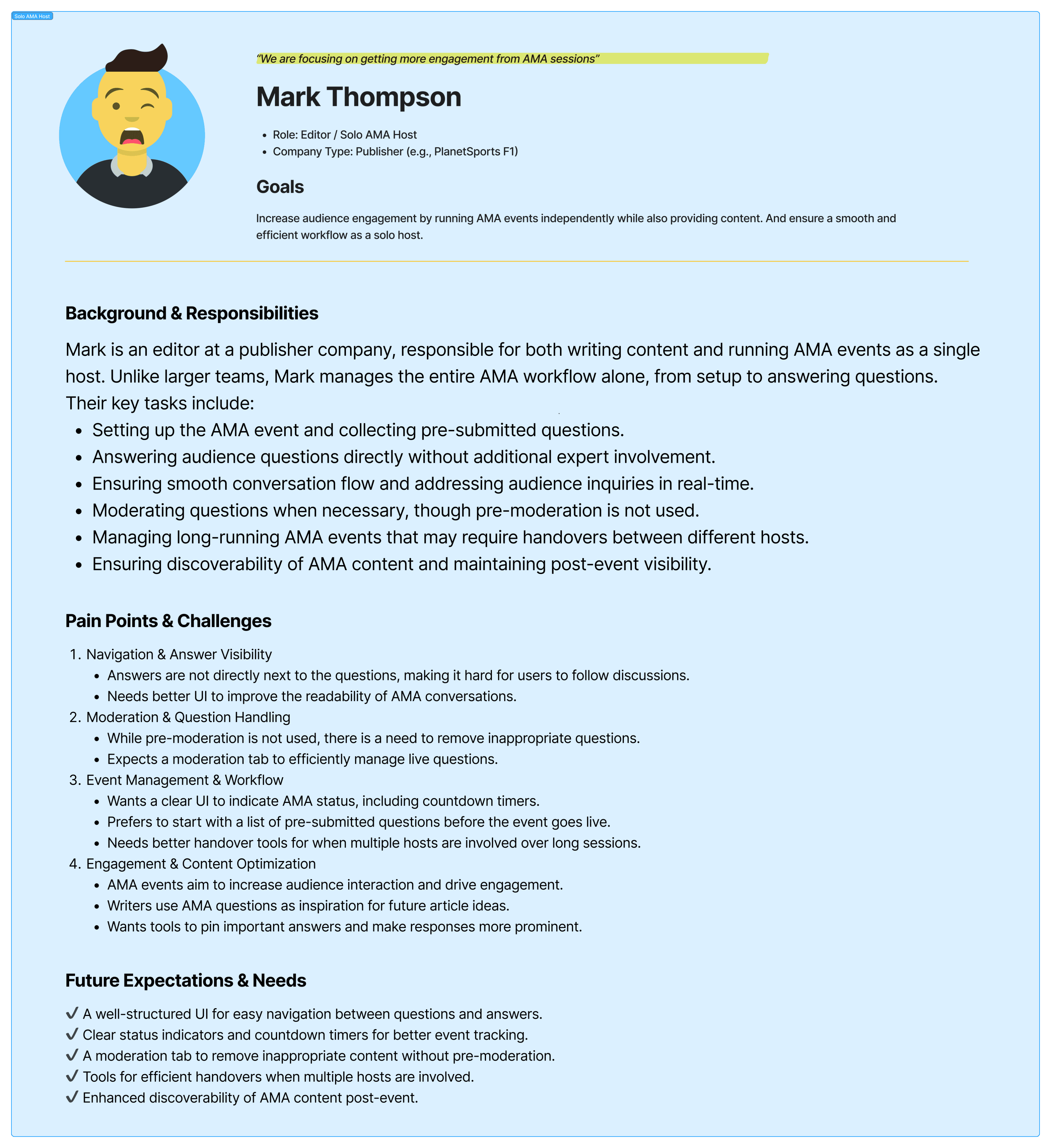
Based on interview data, I created four core personas:
The Moderator – needs tools to manage live sessions smoothly
The Host/Admin – wants to showcase experts and keep engagement high
The Expert - needs to engage with community members by answering questions
The Community Member – wants to ask, follow, and easily find answers
These personas helped the team empathize with real behaviors and frustrations. They directly influenced our MVP scope by grounding feature prioritization in user context.


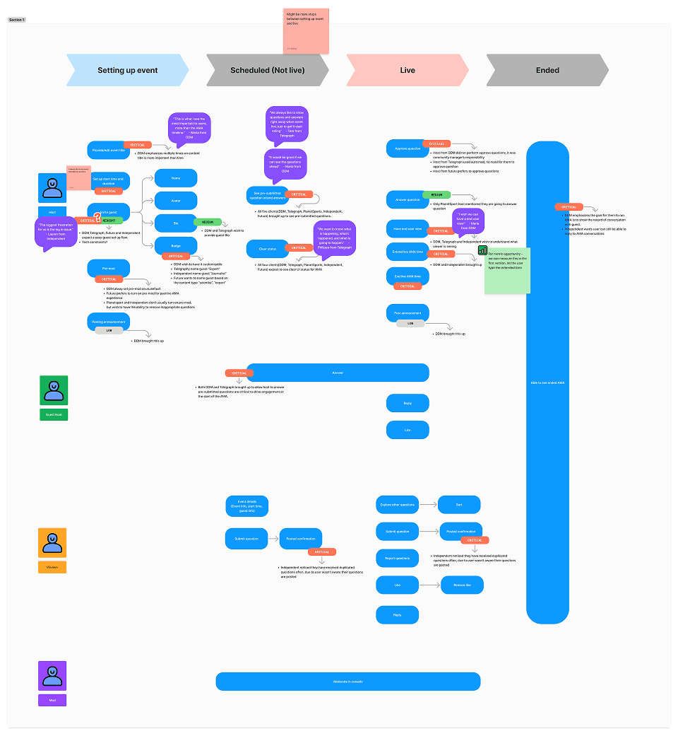
Journey Mapping to MVP
I mapped each persona’s journey across a live Q&A session — before, during, and after the event. This journey map clarified which features were critical at each stage.
This journey map became a key artifact used by the PM to define user stories and estimate development effort.
Design Process
From mapping flows to scalable handoff
User flow
I began by mapping end-to-end flows for key personas: the Moderator, the Audience Member, and the Guest Expert — from question submission to response visibility. These flows helped us:
Align product and engineering around what "success" looked like
Anticipate edge cases like unanswered or hidden questions
Confidently define scope and MVP boundaries

However, due to timeline constraints, engineering couldn’t support a separate “Expert” role in the backend.
To keep us moving, I merged the Expert and Admin roles into a single simplified flow, and updated the user journeys accordingly — ensuring our MVP logic was clear, buildable, and deadline-safe.

Design iterations
We worked in 2-week sprints with internal design critiques, async stakeholder reviews, and weekly engineering syncs
One key example: the “Post Answer” interaction — used by moderators and experts during live Q&As. We tested two variations:
Version 1 - A single text field with a checkbox toggle to let users swtich between Reply and Answer modes.
Version 2 - A more explicit action bar with two options — a primary “Answer” button and a secondary “Reply” text link

After testing with the Admin user and reviewing development constraints, we chose Version 1 — the design with a checkbox toggle. It provided clearer intent through visual hierarchy and eliminated the confusion and clutter caused by too many CTA buttons in limited space. It was also lighter to implement, making it the right choice for our MVP timeline.
Host Flow

Audience Flow

Components documentation
I collaborated with the design team to create a living component library in Figma — ensuring design clarity during handoff and supporting reusability across future projects. The documentation included:
Thread & card components
Button states: hover, active, selected, disabled, error
Input box variations (e.g. character count, placeholder, error states)
Navigation tab styles and behavior
Embedded notes on interaction log

This system not only streamlined engineering collaboration, but also laid the foundation for a more scalable and consistent design experience moving forward.
Debating the why
Before handoff, I often engaged in cross-functional debates around small but critical interaction details. One key discussion centered around the “Reply” and “Answer” actions in the comment thread.
PM’s concern:
“The ‘Answer’ and ‘Reply’ buttons look too similar — users might not understand the difference.”
Design team’s approach:
“Let’s test this flow with actual host users to validate the design.”


I designed a test prototype and ran sessions with three external stakeholders. All of them successfully navigated the flow and clearly understood when to answer vs. when to reply.
Test result:
“This is great!” This is exactly what I was expecting."— Host user

The usability evidence gave us confidence to move forward with the original design — balancing clarity with simplicity — and helped align the team through real user insight, not just opinion.
Final Handoff
As the design phase wrapped up, I facilitated a smooth transition to development by hosting detailed handoff sessions between the design team, PM, and engineers. In these sessions
I walked the team through:
The complete user flows
Interactive Figma prototypes
Edge case handling
How to use Dev Mode in Figma for component variations
Component documentation and annotations

I partnered closely with engineers to address scope gaps — like clarifying the admin's behavior in closed Q&As or edge cases around input validation and no connections. I also performed design QA on each ticket before release using a shared checklist, catching visual bugs and interaction mismatches early.
Key Learnings
This project gave me a deeper understanding of what it means to design strategically — not just creatively. My biggest takeaways were:
✅ MVP Definition Through User Insight
By working closely with PM and engineering, I helped define MVP features based on actual user behavior — not assumptions. We prioritized features that addressed core needs: better visibility for expert answers, smoother moderation, and simplified participation. This clarity helped reduce scope creep and kept the team aligned during sprint planning.
✅ Component Documentation for Scalability
I collaborated with other designers on building core components from scratch and co-created a new design library to support future growth. Documenting variations, states, and logic in Figma (including Dev Mode for handoff) enabled faster implementation and more consistent UI across the board — especially useful for any future iterations or team members.
✅ Navigating Real Constraints
One of the most valuable lessons came from adapting to limitations — like merging the Expert and Admin roles when backend resources were tight. Rather than push back, I reframed the flow and re-mapped the experience, balancing user intent with feasibility. These kinds of trade-offs taught me how to problem-solve in fast-moving, cross-functional settings.